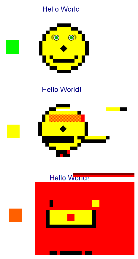
Fehlentwicklung im Web

- Die Absicht hinter HTML war, Dokumente inhaltlich zu strukturieren
- Doch neue Elemente wie
<font>,<blink>oder<center>und Attribute wiebgcoloroderborderkamen hinzu
Nordlicht
- Oktober 1994 veröffentlichte Håkon Wium Lie: Cascading HTML style sheets – a proposal
- Ziel war Trennung von Darstellung und Inhalt
- Einige Ideen waren gut, andere wurden verworfen
- Gut: deklarativ, regelbasiert, vererbend
- ACID-Test um Standardkonformität zu testen
Quelle: Wikipedia
Entwicklung von CSS
- CSS Level 2 wurde im Mai 1998 veröffentlicht
- Bis Anfang 2010 wurde diese Empfehlung allerdings von keinem verbreiteten Webbrowser vollständig umgesetzt
- CSS Level 2 Revision 1 von 2002 bis 2011
- CSS Level 3 seit 2000
- Kein CSS 4, da CSS 3 modular; und nur dessen Module werden weiterentwickelt
- kleine Gescichte von CSS
Code
Aufbau
Struktur
/* Kommentar */
Selektor {
   Eigenschaft: Wert;
   Eigenschaft-2: Wert-2;
   /* … */
   Eigenschaft-n: Wert-n;
}
Beispiel
body {
   max-width: 600px;
   margin: 0 auto;
   font-size: 19px;
   line-height: 1.4;
}
Selektoren
- Kombination aus Bedingungen zur Identifikation von Elementen
- Verschiedene Möglichkeiten: Elementname, Attribute (Klasse, ID etc) oder Position
- Umfassende Listen: Wikipedia, SELFHTML
       * {/* Universalselektor - jedes Element */}
      h1 {/* Typselektor       - alle H1-Überschriften */}
 .active {/* Klassenselektor   - alle Elemente mit der Klasse "active" */}
#wrapper {/* ID-Selektor       - das Element mit der ID "wrapper" */}
img[alt] {/* Attributselektor  - alle Bilder mit einem ALT-Attribut */}
Selektoren – Kombinatoren
/* Nachfahren – alle Links in Navigation */
nav a {  }
/* Kinder – alle direkten Nachfahren von Nav */
nav > a {  }
/* Nachbarn – alle Paragraphen,
   die direkt auf eine H1-Überschrift folgen */
h1 + p { }
/* Geschwister – alle Paragraphen,
   die auf gleicher Ebene auf eine H1-Überschrift folgen */
h1 ~ p { }
Selektoren – Kombinatoren
<h1>Eine <i>Überschrift</i></h1>
<p>Erster Absatz</p>
<p>Zweiter Absatz</p>
<p>Mein <i>Kind, <i>Enkel, <i>Urenkel</i></i></i></p>
i      { color: gold; }
h1 ~ p { color: red; }
h1 + p { color: #bada55; }
p i    { color: hotpink; }
p > i  { color: skyblue; }
Selektoren – Pseudoklassen
<p>Erstes Kind</p> <p>Zweites Kind</p> <p>Drittes Kind</p>
<p>Viertes <a href="//htw-berlin.de">HTW Berlin</a></p>
<p></p> <p>Sechstes Kind</p> <p></p> <p>Achtes Kind</p>
a         { color: skyblue; }
a:visited { color: darkorchid; }
a:hover   { color: hotpink; }

p:first-child,
p:last-child { color: red; }
p:empty { border: solid gold; }
p:nth-child(2n) {
   background-color: #DEA;
}
Selektoren – Pseudoelemente
<br><p>Lirum larum <a data-count="7" href="#">Posteingang</a>
p::first-letter { color: red; }
p::selection { background: gold; }

[data-count]::after {
   content: attr(data-count);
   position: relative;
   top: -10px;
   padding: 3px 7px 1px;
   color: white;
   border-radius: 50%;
   background-color: #333;
}
Selektoren – Pseudoelemente
<table>
   <thead>
      <tr><th></th><th>50y</th><th>55y</th><th>60y</th><th>65y</th><th>70y</th></tr>
   </thead>
   <tbody>
      <tr><th>160cm</th><td>20</td><td>21</td><td>23</td><td>25</td><td>27</td></tr>
      <tr><th>165cm</th><td>18</td><td>20</td><td>22</td><td>24</td><td>26</td></tr>
      <tr><th>170cm</th><td>17</td><td>19</td><td>21</td><td>23</td><td>25</td></tr>
      <tr><th>175cm</th><td>16</td><td>18</td><td>20</td><td>22</td><td>24</td></tr>
   <tbody>
</table>
<br><br>
<small>Quelle: <a href="http://css-tricks.com/simple-css-row-column-highlighting/">Chris Coyier</a></small>
table {
   overflow: hidden;
   border-collapse: collapse;
}

td, th {
   padding: 1em;
   position: relative;
}

tbody tr:hover,
td:hover::after,
th:hover::after { background-color: #ffa; }

td:hover::after,
thead th:not(:empty):hover::after {
   content: '';
   position: absolute;
   left: 0;
   right: 0;
   top: -100vh;
   bottom: -100vh;
   z-index: -1;
}
Einbindung
<!-- Externe CSS-Datei -->
<link rel="stylesheet" href="style.css">

<!-- Internes CSS -->
<style>
   span { color: red; }
</style>

<!-- Inline Styles -->
<span style="color: red;">Hallo</span>
Kaskade
- Vererbung von Eigenschaftswerten an untergeordnete Elemente
body { font-size: 18px; }
p { /* Erbt Schriftgröße von 18px */ }
- Sortierung von Eigenschaften
- nach Wichtigkeit (
!importantund Ursprung) - nach Spezifität (Typ, Klasse, ID, Inline)
- und zum Schluss nach Reihenfolge
- nach Wichtigkeit (
Spezifität
body { color: grey; }        #wrapper { color: yellow; }
.module a { color: red; }    .module a { color: green; }
- Regelt die Stärke von Selektoren um letztlich geltende Eigenschaften zu ermitteln
- Gelten zwei Selektoren für ein Element, gewinnt das spezifischere
- Inline Styles > IDs > Klassen+Attribute > Elemente
- Bei gleicher Stärke gewinnt der letztere
Spezi-
fität
Quelle:
Andy Clarke
Spezifität
<section>
   <h1>Hallo</h1>
   <p>
      <a href="#">Liraum, <strong>larum</strong>, Löffelstiel.</a>
   </p>
</section>
a { color: red !important; }

section > h1 + p > a {
   color: blue;
}

strong { color: blue; }
strong { color: green; }
Elemente
Box Model
Display
Block
Eigener Absatz im Dokument. Können Block- und Inline-Elemente enthalten.
Inline
Stehen im Fluss der anderen Elemente. Können Inline-Elemente enthalten (* und Block)
Kann geändert werden:
div { display: none | block | inline | inline-block | flex | table | ••• }
Display
<section>
   <h2>Kafka</h2>
   <p>Jemand musste <a href="mailto:Josef@kafka.de">Josef K.</a> verleumdet haben, denn ohne dass er etwas <abbr title="Nichts Gutes">Böses</abbr> getan hätte, wurde er eines Morgens verhaftet. <q>Wie ein Hund!</q> sagte er, es war, als sollte die Scham ihn überleben.</p>
   <p>Als Gregor Samsa eines Morgens aus unruhigen Träumen erwachte, fand er sich in seinem Bett zu einem ungeheueren Ungeziefer verwandelt.</p>
</section>
*  { outline: 2px solid blue; }
h2 { outline: 2px solid #666; }
p  { background-color: #DEA; }
a  { outline: 2px solid red; }
q  { outline: 2px solid green; }
Box Model
<div class="custom-box">A A A A A A</div>
<div class="custom-box">B B B B B B B B B</div>
<div class="custom-box">C C C C C C C C C C C C</div>
<div class="custom-box">D D D D D D D D D D D D D D D D D D</div>
.custom-box {
   float: left;
   width: 50px;
   height: 50px;
   margin: 10px;
   padding: 20px;
   border: 10px solid hotpink;
   background-color: skyblue;
   /* box-sizing: border-box; */
}
Floats
floathebt ein Element aus dem Fluss und bewegt es an die linke oder rechte Seite- Andere Inhalte umfließen es
- Floatende Elemente = Block-Elemente
- Clearing: Nachfolgendes Element hat passende
clear-Eigenschaft oder micro clearfix hack
Floats
<h1>Die Leiden des jungen Werthers</h1>
<p>
<img src="werther-lotte.jpg" alt="Werther und Lotte">
Ei­ne wun­der­ba­re Hei­ter­keit hat mei­ne gan­ze See­le ein­ge­nom­men, gleich den süßen Frühlings­mor­gen, die ich mit gan­zem Her­zen ge­nieße. Ich bin al­lein und freue mich mei­nes Le­bens in die­ser Ge­gend, die für sol­che See­len ge­schaf­fen ist wie die mei­ne. Ich bin so glück­lich, mein Bes­ter, so ganz in dem Gefühle von ru­hi­gem Da­sein ver­sun­ken, daß mei­ne Kunst dar­un­ter lei­det. Ich könn­te jetzt nicht zeich­nen, nicht einen Strich, und bin nie ein größer­er Ma­ler ge­we­sen als in die­sen Au­gen­bli­cken.
</p>
h1 { font-size: 1.5em; }

img {
   width: 50vw;
   float: right;
   margin-left: 1em;
   margin-bottom: .5em;
   border: 2px solid #ccc;
}
Quelle: Wikipedia
Positionierung
static |
Standardwert |
relative |
Bleibt in normalem Fluss und wird verschoben |
fixed |
Relativ zum Viewport des Browsers |
absolute |
Relativ nächsten Vorfahren mit position != static |
| Eigenschaften | top, bottom, left, right |
Positionierung
<div class="abs o-r u-l">
   Überall
   <span class="abs o-r">oben rechts</span>
   <span class="abs u-l">unten links</span>
</div>
.abs {
   position: absolute;
   padding: 2em;
   background-color: rgba(0, 130, 209, .3); }
.o-r { top: 0; right: 0 }
.u-l { bottom: 0; left: 0 }
Einheiten
› Relativ zur Schriftgröße
<div class="em">8 Em</div>
› Relativ zur Auflösung
<div class="px">80 Pixel</div>
› Relativ zum Container
<div>80 Prozent des Containers</div>
› Relativ zum Viewport
<div class="vh">80 Hundertstel der Gesamtbreite</div>
body, div {
   box-sizing: border-box;
   width: 80%;
   margin: 8px;
   padding: 8px;
   border: 3px solid hotpink;
}
div { background: skyblue; }
.em { width:  8em; }
.px { width: 80px; }
.vh { width: 80vw; }
Farbangaben
color: red;                   /* Farbname */
color: #f00;                  /* Hexadezimal RGB */
color: rgb(255, 0, 0);        /* Dezimal RGB */
color: rgb(100%, 0%, 0%);     /* Prozentual RGB */
color: rgba(255, 0, 0, 1);    /* RGBa (a = alpha) */
color: hsl(0, 100%, 50%);     /* HSL (Hue, Saturation, Luminance) */
color: hsla(0, 100%, 50%, 1); /* HSLa */
Quelle: MDN
Fonts
<h2>Lorem ipsum dolor sit amet</h2>
<p>Consectetuer adipiscing elit. Aenean commodo ligula eget dolor. Aenean massa. Cum sociis natoque penatibus et magnis dis parturient montes, nascetur ridiculus mus.</p>
@font-face {
   font-family: "Open Sans";
   src: url("/assets/fonts/OpenSans.woff") format("woff");
}
body {
   font-family: "Open Sans";
}
Viele freie Fonts: fonts.google.com
Spalten
<h2>Lorem ipsum dolor sit amet</h2>
<p>Consectetuer adipiscing elit. Aenean commodo ligula eget dolor. Aenean massa. Cum sociis natoque penatibus et magnis dis parturient montes, nascetur ridiculus mus. Donec quam felis, ultricies nec, pellentesque eu, pretium quis, sem. Nulla consequat massa quis enim. Donec pede justo, fringilla vel, aliquet nec, vulputate eget, arcu. In enim justo, rhoncus ut, imperdiet a, venenatis vitae, justo. Nullam dictum felis eu pede mollis pretium. Integer tincidunt. Cras dapibus. Vivamus elementum semper nisi. Aenean vulputate eleifend tellus. Aenean leo ligula, porttitor eu, consequat vitae, eleifend ac, enim. Aliquam lorem ante, dapibus in, viverra quis, feugiat a, tellus. Phasellus viverra nulla ut metus varius laoreet. Quisque rutrum. Aenean imperdiet.</p>
p {
column-count: 2;
column-gap: 2em;
column-rule: solid 1px #aaa;

-moz-column-count: 2;
-moz-column-gap: 2em;
-moz-column-rule: solid 1px #aaa;

-webkit-column-count: 2;
-webkit-column-gap: 2em;
-webkit-column-rule: solid 1px #aaa;
}
@media / media queries
- Bedingte Wirkung von CSS-Regeln
body { font-size: 19px }

@media (min-width: 700px) and (orientation: landscape) { /* ... */ }

@media print {
   * { background: transparent !important; color: #000 !important; }
   body { font-size: 12pt }
   a[href]:after { content: " (" attr(href) ")"; }
   h2, h3 { page-break-after: avoid; }
}
Transitions
<br><br>
<span>☯</span>
span {
   padding: 1em;
   transition: all 1s ease;
   background-color: skyblue;
   border-radius: 0;
}

span:hover {
   border-radius: 50%;
   background-color: hotpink;
}

body {
   font-size: 400%;
   text-align: center;
}
Keyframe Animations
<div class="pulse">⚑<span></span></div>
@keyframes pulse {
    0% {
        transform: scale(0);
        opacity: 0.5;
    }

    100% {
        transform: scale(3);
        opacity: 0;
    }
}

.pulse {
    position: relative;
    display: inline-block;
}

.pulse span {
    z-index: 1;
    position: absolute;
    top: 12px;
    left: -10px;
    display: block;
    width: 30px;
    height: 30px;
    border: 2px solid #8f1b1b;
    border-radius: 50%;
    box-shadow: 0 0 10px 5px #ba2323;

    -webkit-animation: pulse 2s infinite ease-out;
    animation: pulse 2s infinite ease-out;
}

@-webkit-keyframes pulse {
    0% {
        transform: scale(0.3);
        opacity: 0.5;
    }

    100% {
        transform: scale(2);
        opacity: 0;
    }
}

body {
   padding: 4em;
   text-align: center;
   font-size: 200%;
   background-image: -webkit-radial-gradient(50% 50%, circle cover, #FFF, #5CB3FF 90%);
   background-image: -moz-radial-gradient(50% 50%, circle cover, #FFF, #5CB3FF 90%);
   background-image: radial-gradient(50% 50%, circle cover, #FFF, #5CB3FF 90%);
}
Transforms
<div class="">Pur</div>
<div class="a">Rotation</div>
<div class="b">Verschoben</div>
<div class="c">Klein</div>
<div class="d">Schräg</div>
<div class="e">Perspektive</div>
.a { transform: rotate(45deg); }
.b { transform: translateX(2em); }
.c { transform: scale(0.5); }
.d { transform: skewX(30deg); }
.e { transform:
      perspective(200px)
      rotateY(45deg);
   }

/* helper styles */
body {
   display: flex;
   justify-content: space-around;
   flex-wrap: wrap;
}

div {
   float: left;
   width: 5em;
   margin: 1em;
   padding: .5em;
   border: .5em solid #00bd5a;
   background-color: #0082d1;
   color: white;
   line-height: 4em;
   text-align: center;
}
Wow So color Much pretty
<div class="">Pur</div>
<div class="a">Transparenz</div>
<div class="b">Schatten</div>
<div class="c">Rundungen</div>
<div class="d">Farbverläufe</div>
<div class="e">Filter</div>
.a { opacity: 0.5; }
.b { box-shadow: 10px 10px 10px #aaa; }
.c { border-radius: 1em; }
.d { background-image: linear-gradient(-45deg, #0082d1 0%, yellow 100%); }
.e { -webkit-filter: invert(1); }

/* helper styles */
body {
   display: flex;
   justify-content: space-around;
   flex-wrap: wrap;
}

div {
   float: left;
   width: 5em;
   margin: 1em;
   padding: .5em;
   border: .5em solid #00bd5a;
   background-color: #0082d1;
   color: white;
   line-height: 4em;
   text-align: center;
}
CSS-Filter
<style>
   body {
      display: grid;
      grid-template-columns: 1fr 1fr;
      grid-gap: 1rem;
   }
   img { width: 100%; }
</style>
<div><img src="balham.jpg"></div>
<div><img src="balham.jpg" class="blur"></div>
<div><img src="balham.jpg" class="grayscale"></div>
<div><img src="balham.jpg" class="saturate"></div>
<div><img src="balham.jpg" class="sepia"></div>
<div><img src="balham.jpg" class="multi"></div>
.blur {
   filter: blur(5px) }
.grayscale {
   filter: grayscale(1) }
.saturate {
   filter: saturate(5) }
.sepia {
   filter: sepia(1) }
.multi {
   filter: blur(4px) invert(1) opacity(0.5) }
Quelle: simpl.info/cssfilters
CSS-Variablen
<div>Hallo</div>
:root {
  --primary-color: #00bd5a;
  --space-md: 1rem;
}
div {
   color: var(--primary-color);
   border: 3px solid var(--primary-color);
   padding: var(--space-md);
}
Links
- devdocs.io
Schnelle Dokumentation für HTML, CSS, JavaScript und viele mehr - caniuse.com
Browser-Unterstützung diverser Features - Code Guide
Prägnante Best Practices für die Entwicklung von HTML und CSS - CSS blend modes and filters playground
- CSS Best Practices
- The Languages Which Almost Became CSS